Assignment 5 Applying the techniques of illustration and narrative
March 2013
This assignment brought together all the work throughout the course (The Art of Photography 1) and looks at illustrating and narrating a story. I had the opportunity to spend a day at pre-season testing with British Super Bikes at Donington race circuit in March 2013; a subject which interests me and also that I could learn and show a greater understanding of the subject than I have previously been able to.Having planned the categories for my page titles, I set up a criteria list to choose photos to fill the pages:
- Did they link closely to my story?
- Were they of the correct orientation?
- Did the colours of multiple photos work?
- Space available
- Time of day
The following photographs nearly made it into the article:1. Mechanic pulling tyres on a truck.
This is a common sight at race meetings. When considered as part of a magazine page, the man (subject) is lost against the size of the lorries. The man is standing in the sunshine and he can be seen. Colours are consistent with the pages.
2. Two mechanics with fuel drum
Colours fit in with magazine page. A little too bright (blue on jackets overexposed). Decided against advertising the Heath and Safety hazard as I wanted a positive feel to the magazine.
3. Mechanic looking at bike
I liked the expression on the mechanic’s face. It seemed that he was giving the bike care and attention. Different colour scheme so it was a possibility, but discarded for too much clutter in the background.
4. Pair of scooters
Scooters are ridden by mechanics and riders to enable them to travel around the pits more quickly than on foot. These were parked outside the garages. I was looking at rhythm and pattern. I did not include it because the colours and subject did not fit closely enough.
5. Pirelli Tyre lorry
An alternative view of a Pirelli Tyre lorry reflected into the side of a shiny black van. I liked this picture but there was not enough space to include it.
6. Fuel station
Teams collected their pre-ordered fuel from here. It needed more action and less advertising to make it work as part of my page. I decided to use filling a bike and a fuel pump instead.
7. Fire truck
I liked this photo but it was not out on track (fortunately) so I decided it did not really work within the story.
8. Mechanic filling fuel tank
I liked this as a close-up but decided to use a wider shot of filling the fuel tank with a different garage because it worked better to include all of the mechanic’s head.
1. A row of tyres
I looked at rhythm with a row of tyres. I decided to include the tyres lying on their side as a set of curves so these were discarded.
2. Another row of tyres
These tyres were in the lorry looking clean and smart, ready for use. I used a low viewpoint to add interest by standing at the bottom of the steps. Once I had planned out my page, there was not enough room to include this.
3. Tyre warmer
I thought this was interesting when I took it, but when theming my photos decided to use tyre warming on bikes rather than stands.
4. More tyres
Another look at rhythm and pattern. By tilting the camera it created more interest. This was not interesting enough for inclusion.
5. Worn tyre
It’s always interesting to look at tyres at the end of a race and wonder how the rider finished the race. This tyre had been out and was showing signs of wear on one side. I did not have enough drama to use it as part of a story.
1-8 Different viewpoints
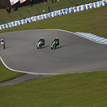
By using different viewpoints, interest is created for the readers.Photo 1 shows the sweeping track, although I could not use the vantage point I wanted to because of work which had been started in the winter months. I settled for this but was not happy with it. I had hoped to show more than one bike on track. I decided to use just 3 riders in the end who I could write about.
9-10
The long shot of an empty track was a consideration for my title page. It is a good view of an empty race track with Donington written across the bridge in the far distance. I the end I used an aerial view of the track. I liked the colours and cloud formation on this.
The track was still being repaired, with gaps in the fences and wires lying around. I decided when planning out my story after reviewing my photos that I had too much material and needed to cut back. Although I liked this picture, it had to go.
1-2
Two riders sat on bikes testing their seating position. I discarded these as there was not enough action in them.
3-4
Two mechanics looking anxiously at data. opted to include a more relaxed pose that I had taken of people leaning over a bike.
5-6
Close up of two mechanics at work improving bike performance. I already had a green one and decided that the yellow and red was the wrong colour for the page.
1 and 8 Queuing for the Pit walk
Raised view of spectators queuing for entry to the pit walk. It showed a mass of people, but I chose a view showing the pits instead. I liked the 3 team jackets which stood out in the crowd. The last photo showed a long line of fans queuing. I was trying to give a sense of numbers.
2. Alex Lowes with fan
Alex Lowes has several fans who want their pictures taken with him. Fans of all ages like him. I chose him with a man instead because he was looking at the camera.
3. Lady with bag
This lady had just had her bag autographed by more riders. She was proudly showing it off to her fried and so I asked her permission to take her photo, using the moment to record her happiness. The photo was too cluttered to use.
4. Lone photographer
There were many photographers present at the circuit. I decided against including photos of photographers, although it was on my original list.
5. Walking stick
A photographer hung his walking stick over the fence and took out his camera. I liked the colours and shape of this and thought it showed that racing appeals to people of all ages. I didn’t have enough space it include it.
6. Fans talking to rider
These fans were talking to a less well known rider. The men were enthralled by a conversation about the snowy weather conditions out on circuit.
7. Fans ride bikes too
There was a long line of motorbikes in the car park on the hard standing. I looked at the rhythm of the wheels. I decided not to include this although it was a colourful photo.
Page 12 All done for today

This rider looked cold and tired whilst removing his helmet and I thought it may be a good ending to the article. I then saw the mechanics and rider in their lorry looking happy and thought it would be a better ending.
Test shots Assignment 4: Applying lighting techniques
18th February 2013
Shape / Colour
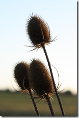
This was a possibility to include in my assignment for shape or colour. I was in position to watch the sunrise behind the teasels. This was the best colour combination. I decided I had a better selection of photos so I did not need to include this one.
Form - Use of flash and snoot to create a hard shadow
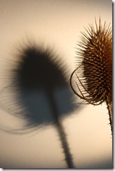
I started looking at how I could include a hard shadow to create interest in form. To start with, I had the teasel propped up in a vase and shone a light to create a shadow on the wall. I thought by cropping the real teasel, I would create interest, but thought I could improve it once I reviewed my pictures.
I turned the teasel upside down and suspended it from the ceiling to give a different effect. The background needed neatening, so I lowered the teasel to just above the floor and put a big sheet of mount board underneath it. I made the snoot smaller and took several pictures until I achieved this effect. With an off camera flash that is controlled by the camera (which I mounted on a tripod) the flash was on for the shutter speed. By altering the shutter speed, I could control the strength of colour and hardness of the shadow and teasel.
Texture - Tungsten lighting with a diffusing cone
This picture was developed by first deciding that a diffusing cone would solve the problem of where to position the shadow. I tried a diffusing cone and decided that it worked. I changed the background to a sheet of black card but the colours were not dramatic enough. By using some black velvet, the light was absorbed and the teasel really stood out.
Texture
This was a test shot in location using shadowless light as a practice for texture. I did not include it as I had more interesting photos.
This was another in location shot using edge lighting. I decided that rim lighting was more dramatic so I did not include it.
Test Shots Assignment 3: Colour
March 2013
Colour Harmony through complimentary colours
“Washday”
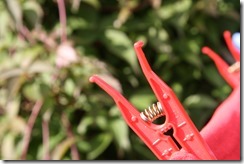
I had this idea whilst sitting in the garden having pegged our the washing. I took a couple of photos. I liked this one because it showed more texture on the tee-shirt. However, when reviewing my pictures, I decided the proportions were not correct (1:1) so I used the second picture.
1/30 F11 ISO100 80mm
“Orange Juice”
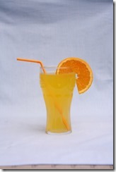
I developed this idea early on in the colour work and experimented with it to take the image I had in my head. I think now, having done the lighting exercises, I would approach it differently. I used natural light on a cloudy day outside and set the arrangement up on a table against the fence with a background pinned to it. I started with a mid blue background:
This was too light, even when taken with a faster shutter speed. I changed to a dark blue background:
Final version, cropped in photoshop
I experimented with different F stops looking at the effect of changing the depth of field. I was conscious that in my tutor feedback from my last assignment, one of the photo’s I took with a shallow depth of field would have been better with a larger depth of field. I decided that F8 made the orange segment in focus and the background weave remained out of focus.
Tape Measure
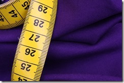
I found this a difficult picture to set up, mainly because I chose an available remnant of purple fabric which had been used in dressmaking and had to fold it in such a way so as to give it a 3d appearance and not show the cut outs.
I started with a couple of pins and a cotton reel:
I was not inspired, although I liked the material so positioned a tape measure instead:
Final version
The tape measure was bolder. I considered the way the numbers were positioned on the tape measure and thought they were better the right way up. I took several photos and used the last picture displayed here because liked the composition and the colours were in the right proportions (1:3 yellow to purple).
The tape measure was bolder. I considered the way the numbers were positioned on the tape measure and thought they were better the right way up. I took several photos and used the last picture displayed here because liked the composition and the colours were in the right proportions (1:3 yellow to purple).
Uniform
Inspired by the colours of the blanket and neckerchief, I started by raising the blanket up on biscuit tins on the table to create a tumbling blanket. I thought there was too much blue and too much going on to tell a story. By singling out one badge with the girl guide promise, I worked on using the folded neckerchief. I thought it needed more interest, so I repositioned the neckerchief again and included a woggle. Being as brown is between red and yellow, I thought it would probably work. The inclusion of the woggle gave a focal point to the picture.
Final version
Colour Harmony through similar colours
Warm Colours
I considered using this fungus for this section because I liked the different stages of development shown. I thought when it came to my final selection that the colours although pink and brown which are warm colours were cool shades of the colours. I chose a yellow fungus instead.
“Anyone for football?”
This was developed after my initial idea was discarded. I thought about using coloured embroidery threads and photographed them in different arrangements, changed the background and display. I decided the image was not creative enough although it showed colour so abandoned it and moved on.
It took me some time to develop this picture into the final image. My son plays for a team who wear orange, and I intended to combine a shirt with training props. One consideration was placement of the objects to avoid showing the sponsors. Another was using different, similar colours.
Photo 1 – colours too similar, composition not creative. Items looked placed rather than linked
Photo 2 – problems with whistle cord staying in place
Photo 3 – Used training bib instead of shirt. Gave a different shade and texture. Cord looked better, shadows distracting
Photo 4 – Use yellow cone to introduce another colour (now 3)
Photo 5 - Orange tiger and shirt, photo becoming disjointed again
Photo 6 - 4 colours, positioned over back of chair for different effect. Did not like the stark diagonal line separating the two fabrics (sponsor underneath)
Photo 7 – Tidy up whistle
Photo 8 – Use 2 cones to add more texture and shape
Photo 9 – Very formal
Photo 10 – Pleased with this, although need to focus on the whistle rather than the back of the shirt.
Final version
Cool Colours
These two photos did not make it into the final selection, mainly because I thought I had stronger contenders. I discovered that I take several photos with this type of colouring because I enjoy being outside. My friend bought a print for her room of sunlight coming though the trees. It inspired me to go out as the sun was setting and look at the effect through my camera. I thought the bright light was warming, so although the trees and ground were cool, the sunlight added warmth.
Storm approaching was inspired by looking through a landscape photography book and thinking about the autumnal colours. Once again, it did not make the selection because of the sunlight making the building appear warm.
Colour contrast through contrasting colours
 I decided this was not creative enough to include in my assignment. Interestingly, when researching for my Assignment 5, I found a few similar pictures to this on the internet, so it was a popular choice of composition on this day. Had the blue have been brighter (maybe taken at a different time of day), I may have used it. Instead I used my sunflower picture.
These oil can were also found at Donington. I took several pictures at different angles before settling on this one. I decided not to include it.
Inspired by the Great British Bakeoff, my son made a red cake. By spooning yellow icing onto it and letting it run down the sides, it made interesting shapes. It was a close contender for my assignment, discarded because it didn’t look real.
Sunflower
In creating this photo, my starting point was similar to my end point, with a period of exploration in the middle.
I started with one sunflower in a vase, and took several pictures of it from different angles and with the sky and clouds as background. Not being sure if I liked it, I added flowers to the vase and concentrated on pictures of multiple flowers. I am not a flower arranger, and decided a single picture was better. My friend lent me her vase of sunflowers to experiment with as hers had larger seed heads. I was after taking yellow and blue together thought hers were too orange. I experimented with different blue flowers in the arrangement on a yellow background. The following day, the weather had changed, providing an almost blue background. I experimented again and apart from the bees which kept arriving, took several photos until I had the one I used as my final picture.
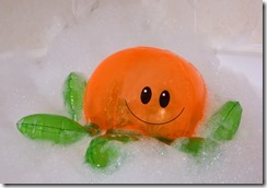 This was my first idea for green and orange. I took a series of photos in different positions with bubbles. I decided not to use it because I found white bubbles difficult to achieve. Now that I have completed my lighting exercises, I will have another attempt.
This was interesting fungus growing on a cycle track in the lake district. I decided not to use it because it would have been better taken with a tripod (which I did not have with me at the time). I liked the composition.
Accent colours
“Back yard”
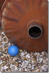
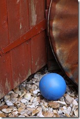
Having come up with the idea of the blue ball and the orange shed, I positioned the ball in a few places and looked at the relationship between the dustbin lid and shed. I thought the first picture looked artificial. The ball positioned in the centre of the frame was not a good composition. The second set were distracting with the funnel of the chimney taking away the focal point from the ball. In a different brief it might work as the viewer may wonder if the ball fitted in the hole, but this was not right. I decided to crop in tighter and use the hinge of the shed as an additional shape.
Jelly babies
I tried a few arrangements of jelly babies before settling on my final version. I thought green as an accent colour was more effective when used with icing sugar intact. The number of jelly babies used was important. Less is more as the saying goes. Washed jelly babies lose definition, become soggy and fall over.
Assignment 2: Elements of Design Test shots
March 2013
Several points in a deliberate shape
These were a couple of test ideas I took before moving on to using strawberries. I decided that the pulses / beans separated in piles looked better that all grouped together.


The strawberries on the plate would look better if the plate was flat. I moved them onto a flat glass plate. Surfaces were something I was experimenting with throughout the assignment.


Composition of Vertical and Horizontal Lines
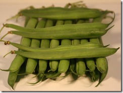
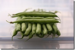
I started with the beans laid on the worktop. In order to make the colours more defined and the background all one colour, I made a light box out of a white plastic storage box. This made the colours darker. I discovered that viewpoint and position of the beans was important. The tops and tails of the beans looked quite untidy, distracting the viewer from the image. I cropped into the beans so that just the centre was visible but I preferred the whole beans. Next time I would consider a neater subject.


Diagonals


I developed the diagonal apple picture by looking at positioning within the frame and choice of surface. By using a napkin for a diagonal line, I was able to lead the eye into the picture. The apple needed space to “fall” so a close up where the frame was filled did not look right.
Apex of triangle at the top


I actually started with the last picture of this group. Having taken the apples and blackberries and photographed them separately, I thought that using the nasturtium added extra colour and shape to the picture.
Rhythm


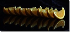


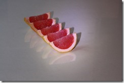

I experimented with different backgrounds to achieve the desired effect. I started off by using the hob for a black and orange effect. This worked apart from the white lines on the hob. It provided an opportunity to look at how many segments I needed to use. I thought it was better well spaced. Too many became overcrowded. I tried using a glass plate and this did not give me the desired effect. I used a sheet of pink card under glass to make it shine which looked more like pop art. I settled for glass on a marble effect worktop as giving the best effect. As the nights were drawing in, lighting became important. I used tungsten lighting to aim light in certain directions. If I was to do this exercise now, I would have basic lighting skills to help improve this, such as flash with a snoot, using a reflector or diffused light.
March 2013
Several points in a deliberate shape
These were a couple of test ideas I took before moving on to using strawberries. I decided that the pulses / beans separated in piles looked better that all grouped together.


The strawberries on the plate would look better if the plate was flat. I moved them onto a flat glass plate. Surfaces were something I was experimenting with throughout the assignment.


Composition of Vertical and Horizontal Lines
I started with the beans laid on the worktop. In order to make the colours more defined and the background all one colour, I made a light box out of a white plastic storage box. This made the colours darker. I discovered that viewpoint and position of the beans was important. The tops and tails of the beans looked quite untidy, distracting the viewer from the image. I cropped into the beans so that just the centre was visible but I preferred the whole beans. Next time I would consider a neater subject.


Diagonals


I developed the diagonal apple picture by looking at positioning within the frame and choice of surface. By using a napkin for a diagonal line, I was able to lead the eye into the picture. The apple needed space to “fall” so a close up where the frame was filled did not look right.
Apex of triangle at the top


I actually started with the last picture of this group. Having taken the apples and blackberries and photographed them separately, I thought that using the nasturtium added extra colour and shape to the picture.
Rhythm


I experimented with different backgrounds to achieve the desired effect. I started off by using the hob for a black and orange effect. This worked apart from the white lines on the hob. It provided an opportunity to look at how many segments I needed to use. I thought it was better well spaced. Too many became overcrowded. I tried using a glass plate and this did not give me the desired effect. I used a sheet of pink card under glass to make it shine which looked more like pop art. I settled for glass on a marble effect worktop as giving the best effect. As the nights were drawing in, lighting became important. I used tungsten lighting to aim light in certain directions. If I was to do this exercise now, I would have basic lighting skills to help improve this, such as flash with a snoot, using a reflector or diffused light.













No comments:
Post a Comment